|
EXERCISE #1
- updated
MEAN GLOBAL CLIMATE PATTERNS: RADIATION & TEMPERATURE
Word format updated
PDF Format
updated
Step 1: First, briefly review the concepts of radiation
and the energy
balance by reading the handout distributed in class and pp 1-5 in Chapter
1 of The Global Climate System.
Step 2: Now go to the University of Oregon, Dept of
Geography's
Global Climate
Animations Site. The "animations" shown here are really month-to-month
views of the mean (average) global patterns of a variety of different climate
elements (or variables) obtained from the model-based output of the
NCEP/NCAR 40-Year Reanalysis Project.
Step 3: Visit each animation on this site to familiarize yourself
with the mean and seasonal patterns of these major climatic elements. You
can click on the images to see a larger version of the animations. Use the
flash version of the images to be
able to pause on a particular month, click through the year at your own pace,
and toggle back and forth between two months. Read through the captions
beside each animation and take notes on the main features you see on each
map.
Step 4: Answer the questions below. Type out your answers on a
separate page by cutting and pasting the questions into a Word document, typing
in your answers, and printing out your completed version.
Guidelines on answer
length:
Write a short paragraph of a few
(3-5) sentences for each answer, adjusted as needed
depending on the complexity needed for the answer. The main
goal is to get you really LOOKING at seasonal -- and
especially geographical -- changes in the components of the
radiation balance. Writing out the answers is simply a way
to encourage careful and curious looking and thinking!
PART A -- Visualization of Mean ENERGY
/RADIATION BALANCE Global Climate Patterns via Animations
1. The first animation represents the monthly variation
of Net Short-Wave Radiation which is the amount of short-wave radiation
(i.e., solar radiation (ultraviolet and visible light) coming in
minus the short-wave radiation going out (or being reflected) at the
surface of the Earth.
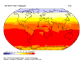
Question #1a: Where on Earth and during what months and
seasons do the lowest values of net short-wave radiation occur?
Question #1b: Speculate on and explain WHY this pattern occurs.
2. The second animation represents the monthly
variation of Net Long-Wave Radiation, which is the amount of longwave
radiation moving toward the surface from the atmosphere (the Greenhouse
Effect) minus the amount of longwave (terrestrial) radiation being
given off from the Earth's surface and moving upward and eventually out to
space. As indicated in the animation caption, positive values (yellow,
orange and red shades) represent energy moving toward the surface,
negative values (blue shades) mean energy moving away from the
surface. The maps are blue everywhere, meaning more longwave energy is moving
away from the surface than is coming in, but in some spots the blue color is
very dark, indicating lots of outgoing terrestrial energy in these
locations.
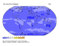
Question #2a: Where and during what months (or
seasons) is the Earth's surface radiating the most long-wave radiation out
to space?
Question #2b: Speculate on and explain WHY this pattern occurs.
3. The Net Radiation animation represents how
much energy is available at the surface of the Earth in different locations
and during during months when all the radiation (both shortwave and longwave)
moving away from the surface is subtracted from all the radiation (both
shortwave and longwave) moving towards the surface. Yellow orange and
red areas experience a net gain of energy at the surface, blue areas
experience a net loss of energy.
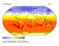
Question #3a: Where and during what months (or
seasons) is the Net Radiation the lowest?
Question #3b:
Where and during what months (or seasons) is the Net Radiation the highest?
Question #3c: Speculate on and explain WHY this pattern
occurs.
4. Now look at all three of the above animations
synchronized together on one page:
Question #4a: Which animation (Net Short-wave or Net
Long-wave) varies the least (shows the least color changes)
geographically (from pole-to-equator-to-pole) and seasonally (from
January-December)?
Question #4b: Which animation (Net Short-wave or Net Long-wave)
varies the most?
Question #4c: Describe what effect this has on the geographic
and seasonal variations in Net Radiation.
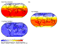
5. Now compare the Net Radiation animation with
the Air Temperature (at the Surface) animation. (One way to do this is to open
up two windows of your browser and re-size them so that they are both visible
on the screen at once. Then open up the flash version of Net Radiation in one
window, and the flash version of Surface Temperature in the other and use the
"Next Frame" option to click through the months side by side. )
The
patterns of Net Radiation and Surface Temperature have some similarities, but
there are also some striking differences. For example, note that the bands of
color are zonal (oriented east-west) on the Net Radiation image, while
the bands dip poleward and equatorward with the seasons over the continents on
the Surface Temperature image. Now answer the following question:
Question #5: Speculate on and explain why there is
not a perfect correspondence between the patterns of Net Radiation and
Surface Temperature? (HINT: read through the section on
Non-Radiative
Components and the Surface Temperature section caption.)
-------------------------------------------
THOUGHT QUESTION
(you do not have to write out the answer to this --
but think about it and be ready with ideas to share in class):
What role do the components of H (Sensible Heat Flux),
LE ( Latent Heat Flux) and G (Change in Heat Storage) play in
the seasonal variations of mean Surface Temperature in different parts
of the globe and how does this happen (explain the processes using concepts of
thermodynamics, phase changes, etc.)
-------------------------------------------
PART B. Comparing Two Kinds of
TEMPERATURE MAPS UPDATED
Create the following maps, saving each as a .gif file which
you insert in an MS Word document:
NOTE: these
are revised instructions for making the temperature maps --
the directions posted last week won't work now because of
"transition" changes at the "Visualize NCEP Data" website.
Go to the following link:
ESRL-PSD Interactive Plotting
and Analysis Pages for Monthly/Seasonal Climate Composites:
http://www.cdc.noaa.gov/cgi-bin/data/composites/printpage.pl/
Then select the menu choices exactly as
indicated below to plot simple black & white contour plots
maps for two kinds of temperature maps:
Map #1 - Air temperature adjusted to sea level (1000 mb)
Month: January
Map #2 - Air temperature adjusted to sea level (1000 mb)
Month: July
Map #3 - Air temperature at the surface Month: January
Map #4 - Air temperature at the surface Month:
July

Question #6: Compare and contrast the two ways of
mapping temperature patterns by comparing the two January
maps and the two July maps that you constructed. In your
comparison, discuss: a) where in the world the map patterns
are similar, b) where they are different, and c) what
accounts for any differences you've observed.
Now construct four more maps to examine
the mean monthly temperature patterns for the months
occurring just after the March and September Equinoxes:
Map #5 - Air temperature adjusted to
sea level (1000 mb) Month: April
Map #6 - Air temperature adjusted to sea level (1000 mb)
Month: October
Map #7 - Air temperature at the surface Month:
April
Map #8 - Air temperature at the surface Month: October
Question #7a: Since the equinox
times represent (theoretically) the time when the Northern
and Southern Hemispheres are each receiving roughly the
same latitudinal inputs of solar radiation, we might expect
the global temperature patterns during the post-equinox
months of April and October to be similar to each other.
Are they?
Question #7b: Speculate on why
or why not, pointing out and explaining specific locations
(if any) where the patterns differ between April and
October. As you explore this questions, also compare the sea
level vs. surface temperature maps in April and October and
note similarities or differences between the two types of
maps.
-------------------------------------------
THOUGHT
QUESTION: (you do not have to write out the answer
to this -- but think about it and be ready with ideas to
share in class):
WHEN and
WHY might you want to use a map of air temperature adjusted
to sea level and WHEN and WHY might you want to use a map of
air temperature at the surface?
-------------------------------------------
|


